 by Shelly Jeffrey
My work focuses around the emotional aspect, which invariably means people are involved, however, like Kiefer; I believe the landscape has an emotional overlay, more so when it has witnessed a traumatic or emotional event.
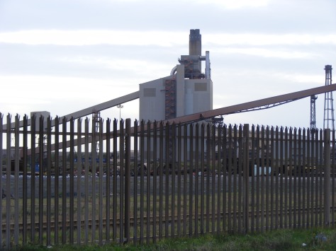
My current project is focused around the closures of the steel industry; I want to capture the whole embodiment of the event and work on ways to express the effects, the feeling of loss by experimenting with various applications of paint, media and in turn hopefully find ways to recreate more easily to lessen impact on my physical conditions. Visiting the site several times and joining in with others (Emily Hesse) I really ‘felt’ the emotion, even the gloomy weather seemed to ooze out a feeling of utter helplessness as the Steel Industry at South Gare was forced to close. In the photos I took, I tried to capture this feeling, focusing on spatial awareness, with the ‘works’ in the background as an industry ‘fading away’, in the foreground the piles of unused coal for the coke works, a tell tale sign of an industry ground to a halt. I am particularly drawn to the contrasting structures jutting out of this sparse landscape, surrounded by a wildlife sanctuary but littered with signs, pylons, telegraph poles and other hints of a recently running industry. Still fresh and raw are the effects of the recent closures but too soon for nature to reclaim, yet it waits, as the boundaries smudge ever closer day by day.
So I hope to reanimate in my artwork that mood and feeling that I felt on my visits and pay tribute to recent steelworkers made redundant but also our ancestors, who I felt loomed around in the ether as if saying their goodbyes with sadness at something that wouldn’t have happened in their time.
My art direction materialises as I begin to filter through all of the exploration of my subject, I skirt around the outer circle; media reports, internet, site visits, taking photographs, talking to people from taxi drivers to those I meet on the street and family connected to the steel industry, also artists who have worked on a similar theme.
Grayson Perry The Annunciation of the Virgin Fig 2
 fig 1
fig 1
Grayson Perry’s Vanity of Small Differences Exhibition, whose show I was lucky enough to be personally guided around by the Curator of the Walker Gallery in Liverpool. It is the content, the narrative of his modern rendition of the Rakes Progress, how he looks at his subject and finds his own personal interpretation of it. Perry uses whatever media he feels befits his idea, he does not limit himself to paint and ceramics, he uses anything to make his vision materialize it. He has helped me think outside the box and widen my experimentation losing self-made restrictions, especially helpful now I cannot work the same way I could years ago, if there’s a will there’s a way!
I wrote to Sky Arts Artist of the Year 2014 Christian Hook, as he inspired my approach to art, as did Bourgeois, meaning to use all of who you are and express it in your work. By calling on your own unique set of experiences you are far more likely to produce a more honest in part ‘confessional’, but more importantly unique composition, because there is no one else like me.
 Kaloust Guedel
Kaloust Guedel works a lot in ink and flow, creating mixed media pieces, he has quite often influenced my work as he strives to be unique by being true to himself, I, like him, am not a follower of fashion but endeavour to pull out unique expression to match whatever subject inspires me to do so. “I create the way I feel” – Guedel

Angela Chalmers
Exhibitions are paramount in promoting my progression and inspiration: ‘Localism’ at Mima, was specifically relevant to my project so I spent a lot of time taking it all in, talking with staff and the wife of one of the artists. I also regularly visit The Hub in Redcar, most recently artist Angela Chalmers who works with inks using line and flow, one piece on the back of a semi opaque material called Melinex, using lights to enhance the image specifically inspired my use of acetates
Yorkshire Sculpture Park organised by Ikuko, – Bill Viola’s work was amazing, I bought a book ‘Jungu Yoon Spirituality in Contemporary Art, The Idea of the Numinous,’(i) I am a deeply philosophical and Spiritual Person and this book talks of how Spirituality is represented in different modes of contemporary art showing Viola’s Five Angels for the Millennium. The poppy tribute and notes left in the boathouse were also inspiring and made me think of ways to show ‘tributes’ to our steelworkers who lost their jobs.
December: Trip to Edinburgh Galleries and Museums. Spoke with curators, staff and resident artist who explained William Gears work and gave me inspiration to stay true to my own style and beliefs.
Doodle Diary” –
I have always loved the free flowing work surrounding a solid image, often seen in photo-shop in my recent work last year, I tried to mimic this style using spray-paint as a ground, then built up layers, using, collage, acetates and acrylic, ink, enamel resins and wax. It was a fabulous way of experimenting, working with various materials but I would have preferred a flatter image, varnish didn’t work as some of the mediums I used were not waterproof and ‘moved’ over this huge multi layered canvas A glass cover was simply not viable due to cost, time but also the glare of exhibit lights.
So with the knowledge gained from my last project, I started this one with free flowing ink to kind of loosely map out the landscape just using ‘feelings’ and intuit, limiting my colour palette with intent to represent another fading industry.

Following on with thought on the use of colours as a representative of ‘Feelings’ i.e. loss of jobs, industry, I did some more detailed portrayals of the landscape and began experimenting with different mediums, charcoal, acrylic, ink. I realised b&w, sepia or perhaps rusted steel colours would better represent my intention of sadness and loss.
 Pen and ink
Attending Stephen Gill’s Lecture was illuminating, his captured images on the SSI site that held narrative in their composition, his use of blurred shots and spatial awareness brought drama to his compositions. After a requested tutorial, I spoke to him about my intentions of recording the ‘feeling’ of another fading industry and my interest in trying to infuse ‘layers’ of the several areas of loss involved. He suggested ‘blurring the shot, not having technical expertise he suggested doing this by simply moving the camera, and sticking to a limited palette, after viewing my initial works in ink, also suggested researching Gerhard Richter. I took his advice and went back to the site to take more photos as well as several ‘depth of field’ shots to work with. Looking up ‘Richter’ actually reinforced my interest in Anselm Kiefer as he kept popping up on Internet searches, previously I had been focusing on Kaloust Guedel but now feel my direction developing.
Anselm Kiefer Falling Stars 2006
“Sadness and Loss, like a death, devastation, affecting so many lives, a rippling effect, wave after wave, I felt I needed a stronger idea to befit this catastrophic event.” Kiefer’s intention oozes from his mixed media pieces, the bland colours of greys and browns, like when colour has been drained from the landscape because of the devastation of war which is the subject of many of his pieces, then the spattering of ‘tributes’ he leaves lying around in stars or as little wooden plaques in ‘Falling Stars’ (shown) further drama comes from the sheer size of his canvasses and speaks of the velocity of war and the death, devastation, sadness, loss and guilt and many other mixed emotions it leaves in its infinte wake.
“Anselm Kiefer – He strongly believes that landscapes must always be guilty for what they have witnessed and what has happened on them”
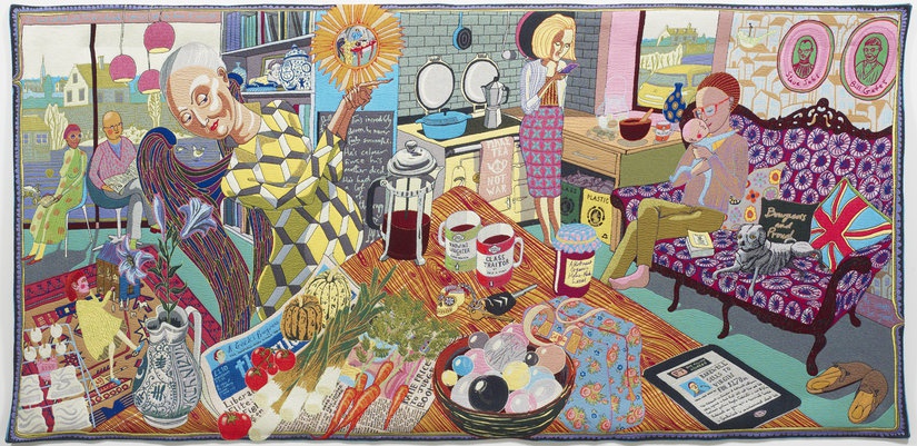
 Expressions in ‘Pain’(t) Shelly Jeffrey 2015 6ft6”x4ft Acrylic on Canvas
One of my strongest pieces in a recent project was ‘Expressions in ‘Pain’(t) I focused on one thing, ‘Emotions’, specifically to do with how my health can make me feel when in relapse. Linking back to this painting has guided this project as I endeavour to find more ways to lessen the impact on my body but still appease my imagination and ideas so I can perform my intentions. Having tutorials with Sue Gough and Aikaterini Gegisian, helped me get back on track as I was getting a bit bogged down with all the landscape photos I had taken and portraying them instead of focusing on what mattered most to me, ‘people’, and emotion.
I attended a Lecture by Emily Hesse-MIMA and was drawn in by her passion and interest in the Steel Industry and its History ‘No Silence Here’.
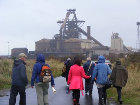
Photo by Shelly Jeffrey
The walk with Emily Hesse and Mima staff, including James Beighton Curator and Senior Curator Miguel Amado who took great interest in my being there as I was the only student present, he asked about my project and interest in the Steel Industry, I talked to him about my connection to it and explained how I intended to pay tribute in my current art project, he asked me to keep in touch. Many photos were taken and appeared on several public domains through Mima and Emily Hesse. We joined in thought to say a few words reflecting our own unique emotional response, I stumbled to speak coherently as I felt the emotionally charged atmosphere and I knew I had gotten what I had come for, to really ‘feel’ and cement my direction in performing art based on predominantly South Gare’s Steel Plant.
Experimenting with acetates, newspaper, photo transfer creating interesting accidents, partial mark of a pylon I accidently pushed onto card leaving a faded imprint that looks like iron filings.

Recent Screen-printing gave me a lot of material and I loved the effects I could achieve from it, however it had a huge toll on my body so it is not a viable avenue I can pursue, however after talking with Jan who runs the print room, we were able to realise a less impactful direction using tracing on acetates and reprographics, utilizing and manipulating my digital images via Photoshop and other programmes, then transferring images onto various surfaces.
My intention at this point is to manipulate digital images to create a painting or mixed media piece.
 Paris
Paris
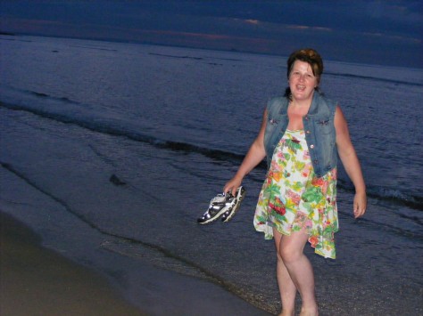
10,000 shoes laid in place of banned protest in Paris after state of emergency called due to the recent terrorist attacks.
This is the image that inspired my focus for this project and prompted me to use commisioned images from my cousin of his work uniform ( I tried to get my own images but their uniforms are the property of the company and therefore cannot leave the site)


 Review: I prefer the matte type finish, so glossy photo images I don’t feel best represent my intentions of portraying loss and devastation, also full colour isn’t going to work.
As in someone who has suffered loss or a shock, the colour drains from them and this is the direction I feel works, black and white, faded images, dripping flows of diluted acrylic and some kind of imagery that I can get flat enough and match it in smoothly with my paint application and collected newspaper stories, which hold some very apt words which I feel important to express in my composition’s narrative.
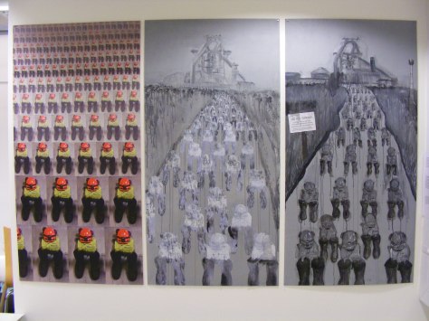
So the three 1210x610mm mdf. boards are the starting direction for my exhibition ahead and a culmination of experiments so far, one having a different texture to enhance the paint flow and application. I felt a need to redirect my focus on the people, as this is where the main emotion lies and where my initial intention began.
They stand like pillars or steel girders as per my intention in representing “Men of Steel’, but brought to their knees by forced redundancy due to closure of their place of employment.
Sizes specifically chosen to fit quite tight exhibiting area, but hopefully optimizing it for full impact, (I only had 2cm that I could space them at and had to use a ‘Level” to hang them straight as I discovered the wall to be warped.)

Call it ‘synchronicity’, but to actually have a steel girder running through my exhibit area when my theme is ‘Steel’ was an absolute gift! It made me think of the rows of steel lockers in the background of photos I used to create my three boards and where the steel workers uniform was kept. I simply had to place my own rendition there in tribute, so using items of work wear I have collected over the years, I sat them there in front of the girder and I really feel it pulls all of my pieces together.
“Steel’ is the theme and it runs right through my presentation, the hanging of it, inspired and focused around the girder that runs through my exhibiting space, from the silver frames to the nails that hold it up.
This is my tribute to the people of Teesside affected by the recent steel closures.
Illustrations
Anselm Kiefer http://www.tate.org.uk/art/images/work/AR/AR01166_9.jpg
Kaloust Guedel http://hkazanfinearts.com/kaloust-mt-15-M.jpg
Fig 4 Shoes France
https://www.facebook.com/photo.php?fbid=10153795616879136&set=a.98992549135.111599.611574135&type=3
Books
i Spirituality in Contemporary Art The Idea of the Numinous Jungu Noon Zidane Press www.zidanepress.com Copyright Jungu Noon 2010


You must be logged in to post a comment.